- Packages I will use to read in and plot the data.
- Read the data in from part 1.
Interactive Graph
Start with the data
Group_by country so there will be a “river” for each
Use mutate to round CO2emissions so only 2 digits will be displayed when you hover over it.
Use mutate to change year so it will be displayed as end of year instead of beginning of year
Use e_charts to create an e_charts object with year on the x axis
Use e_river to build “rivers” that contain per capita CO2 emissions by country. The depth of each river represents the amount of per capita emissions for each country.
Use e_tooltip to add a tooltip that will display based on the axis values
Use e_title to add a title, subtitle, and link to subtitle
Use e_theme to change the theme to roma
country_co2   %>%
  group_by(Country)  %>%
  mutate(CO2emissions = round(CO2emissions, 2),
         Year = paste(Year, "12", "31", sep="-"))  %>%
  e_charts(x = Year)   %>%
  e_river(serie = CO2emissions, legend=FALSE)  %>%
  e_tooltip(trigger = "axis")  %>%
  e_title(text = "Per Capita CO2 emissions, by Country",
          subtext = "(in billions of tonnes). Source: Our World in Data",
          sublink = "https://ourworldindata.org/explorers/co2?facet=none&country=CHN~USA~IND~GBR~OWID_WRL~AFG~Africa~ALB~ZWE~ZMB~YEM~WLF~VNM~VEN~VUT~UZB~URY~Upper-middle-income+countries~ARE~UKR~UGA~TUV~TCA~TKM~TUR~TUN~TTO~TON~TGO~TLS~THA~TZA~TJK~TWN~SYR~CHE~SWE~SDN~LKA&Gas=CO%E2%82%82&Accounting=Production-based&Fuel=Total&Count=Per+capita",
          left = "center")  %>%
  e_theme("royal")
Static Graph
Start with the data
Use ggplot to create a new ggplot object. Use aes to indicate that year will be mapped to the x axis; per capita CO2 emissions will be mapped to the y axis; country will be the fill variable
geom_area will display per capita CO2emissions
scale_fill_discrete_divergingx is a function in the colorspace package. It sets the color palette to roma and selects a maximum of 12 colors for the different regions
theme_classic sets the theme
theme(legend.position = “bottom”) puts the legend at the bottom of the plot
labs sets the y axis label, fill = NULL indicates that the fill variable will not have the labelled Region
country_co2   %>%
  ggplot(aes(x = Year, y = CO2emissions,
             fill = Country)) +
  geom_area() +
  colorspace::scale_fill_discrete_divergingx(palette = "roma", nmax =11) +
  theme_classic() +
  theme(legend.position = "bottom") +
  labs( y = "in billions of tonnes",
       fill = NULL)
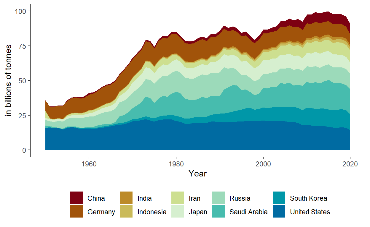
These plots show a comparison of per capita CO2 emissions by some of the top countries contributing to climate change, as well as an overall increase in emissions in every country. The range of data is from 1950 to 2020.